
PZ Myers over at Pharyngula is more pleased than he should be with some “flashy illustrations” of the creationism menace. “Use these!” he admonishes. Um, maybe not.
While the graphs are flashy and, in their way, are informative (though I'm not crazy about the choice of pale red [is not explicitly mentioned] as intermediate between green [is mentioned directly] and dark red [isn't mentioned]—pick a better color palette, guys!), there are significant scaling problems. When one ostensibly represents ratio data with the linear dimensions of objects possessing area, the visual impact is seriously misleading. Perhaps this sounds fancy, but it's not.
Suppose you want to compare a data value of 16% with a data value of 32%. The latter is twice as much as the former. In a bar chart, one would be twice as tall as the other. Simple:

You can't get much more basic than that. However, what if you decide to represent your data with cute little gingerbread men? It's quite obvious that the one representing 32% must be twice as tall as the one representing 16%, right? Except look at what happens:

It's the classic problem of scaling. Doubling the linear dimensions of a two-dimensional figure results in a quadrupling of its area, immediately creating an exceedingly misleading visual impact. To maintain a correct visual impression in a situation where two-dimensional area rather than one-dimensional length catches the eye, the linear scaling factor should be the square root of 2 (approximately 1.4142) rather than 2 itself. The results are much better:

This is exactly the problem with the Campus Explorer's iconic graph of teachers' personal beliefs in evolution vs. creationism and intelligent design creationism. The purple figure representing 28% looks like it's quite a bit more than twice the 16% icon. The 16% icon similarly looks a lot bigger relative to the 9% icon than it should. The Discovery Institute will certainly be delighted with the colossus representing adherence to ID creationism.
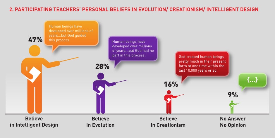
With some elementary (and not particularly elegant) picture editing, I offer this statistically improved version, whose visual impact is not misleading:

Darrell Huff warned us about misleading data graphs in How to Lie with Statistics, originally published in 1954. We have yet to learn the lesson he tried to teach us.


16 comments:
Yeah, I noticed that too.
I read How to Lie with Statistics when I was a kid, been thinking I should reread it.
I'm sure you're technically right.
But somethow that 32% gingerbread man simply doesn't look twice as big as the 16% gingerbread man in your second gingerbread graph. And the gold teacher doesn't look 5 times as big as the green one in your second teacher graph.
Maybe because all the figures are on the same baseline, the eye tends to see the height more than the area. How about simply changing only the height of the figures, or moving them off the baseline?
DicePlayGod, I suspect you're doing a good job of suppressing the horizontal component and homing in on the height, in which case the twice-as-tall gingerbread man may not seem disproportionately large to you. It would be interesting to learn how much research there is on the question of whether people derive correct information from differently scaled charts.
IIRC, quite a few studies have shown that people are really quite bad at estimating relative area and quite good at estimating relative length. The APA (American Psychological Association) has specific guidelines about when it's appropriate to use pie charts and other area representations of proportion: not often.
Further to Miki Z's point, I have the opposite problem to DicePlayGod. My brain represents the "gingerbread men" as 3D human figures, so Zeno's proposed graph does not go far enough for me. To my perceptual system the linear scaling system should be the cube root of 2, not the square root. Then the implied volume and mass of the human figures come out right, so there would be a case for saying that this is the only accurate representation.
However, there's still a problem. The square and cube root solutions would be highly misleading for anyone who takes the height of the figures or bars as their cue - which is probably most people.
So size cues of 2D and 3D representations are ambiguous and will therefore be interpreted differently by different people's people's perceptual systems. It might be better to represent the numbers by something less ambiguous, for example different-sized groups of same-sized figures - perhaps stacked vertically to preserve the linear vertical scale?
Zeno, long time no post. Just wanted to commend you for this one, and the note you left at Pharyngula.
I was wondering if someone would make Durban_Legend's point, because some figures imply three-dimensionality and confuse matters even further, depending on the visual impact they have on the individual user.
Good to see you, Scott! Thanks for stopping by and dropping in a comment.
I'm with DicePlayGod; I think the original graph has much more visual impact than your mathematically-correct graph, but admittedly, I was looking at height rather than size. Maybe this is a math-literacy thing; the math dullards in the crowd see the original graph the way its authors intended, and the rest of you don't?
I quite agree with you, Interrobang, that the original graph has more visual impact. (For one thing, the figures are bigger!) However, I think it's a misleading impact for most people. Once it's filtered through individual perceptions, it may or may not give an appropriate impression of the relative values of the depicted data. Cleverness in graphs can easily be excessive and subject to misleading readings (taking particular note of Durban_Legend's telling comment).
At least bar charts are mostly safe.
DM: I give you ONE FINAL WARNING
Liar.
I've been reading through "The Algebra of Grand Unified Theories" from the latest Bulletin of the AMS (47 3). Have you seen this article, Zeno? Fascinating stuff.
They're not paying attention to you either
Indeed, not. and we were having an easier time of it before someone started feeding the troll.
(not that it isn't fun to watch, in its way)
unapologetic: before someone started feeding the troll
Yes, I know. Normally I am quite circumspect about poking a pointed stick through the bars of the rabid animal cage, but this week I had some free time to sit at my computer and vent my spleen. But I grow weary of engaging in a battle of wits with an unarmed man, so I will return to casually purging his excrementious (and dull) comments.
I thank the sane visitors for their patience.
Miki: I've been reading through "The Algebra of Grand Unified Theories"
Way to draw my attention to something more constructive! Thanks, Miki. No, I hadn't seen it.
Post a Comment