The front page of the San Francisco Chronicle on Tuesday, August 25, 2015, made it perfectly clear: The stock market had crashed. The headline “Plunging markets” was accompanied by an illustration that made the disaster graphically clear—provided you didn't read the fine print along the margin. The understated labeling of the vertical axis was, fortunately, reinforced by the actual numbers. The Dow Jones was merely down 588.40 from 16,459.75, a drop of 3.5748% (which the Chronicle over-rounded to 3.58%). Yes, that's a significant market correction in a market widely viewed to be overvalued. Not exactly an apocalyptic result. Nicely eye-catching headline, though.
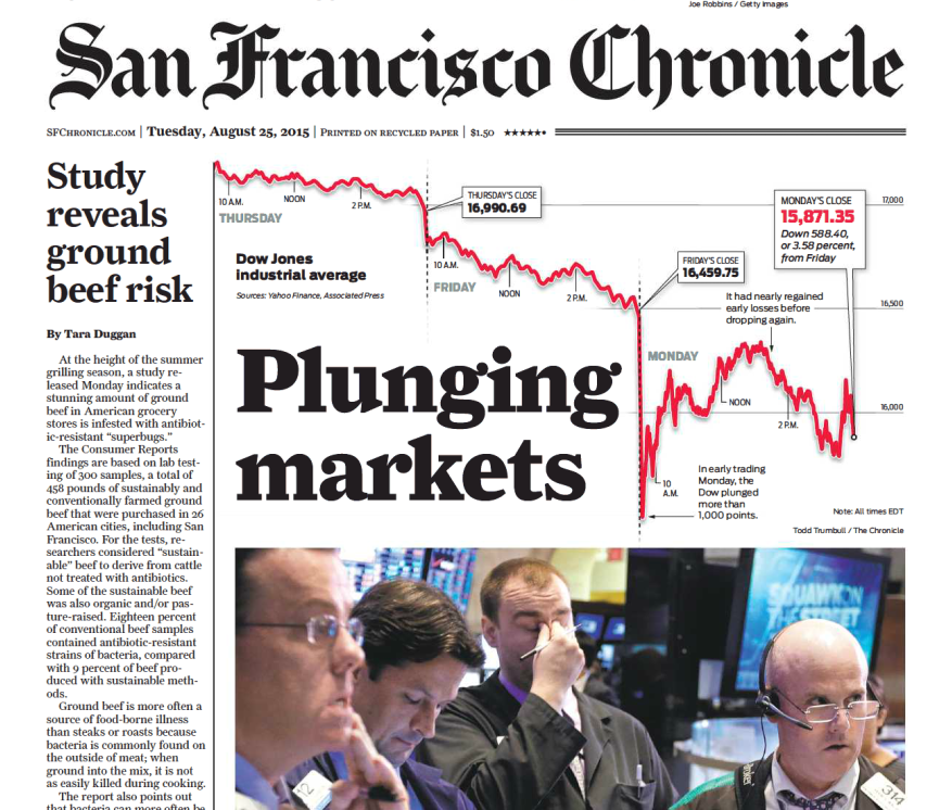
A better perspective on the issue shows why the market chart would have been quite underwhelming if drawn to a scale that including the zero point. The grid lines representing 1000 points on a hard copy of the Chronicle were separated by 6 centimeters and ended at 15,500 along the bottom edge of the graph. To extend the chart down to its zero-line would have required an additional 93 centimeters (36.6 inches). That's right: It would have extended an additional yard below the printed chart and (since the newspaper isn't that long) more than two feet below the paper's bottom margin.

A fold-out extension would have attracted more attention to the front page, but ruined the message.
By way of comparison, a real economic disaster on the order of the notorious crash that ushered in the Great Depression involved a 13% drop on “Black Monday” (October 28, 1929) and another 12% drop on the immediately following “Black Tuesday.” The losses continued to accumulate and full recovery, as we know, took decades.
What about this week's “plunge”? The Business Insider published a report with an appropriate title: “After all that, the stock market finished the week higher.”